Read the real brand
The live stylesheet is parsed for the colours, type stacks, and logo it actually uses — ranked by how much each one is really used, not by what looks nice in a screenshot.

Portfolio · hero sections, brand-matched
Each piece below started from one thing: a live website URL. The colours and type are pulled from that site's real stylesheet, contrast-checked against WCAG AA, and built into a single self-contained HTML file — no build step, no framework, no CDN.
> HOW THE MATCHING WORKS
The colour extraction is deterministic and takes under a second. Deciding which colour is the real brand hue — and where one has to bend to stay readable — is a person, every time.
The live stylesheet is parsed for the colours, type stacks, and logo it actually uses — ranked by how much each one is really used, not by what looks nice in a screenshot.
A human picks the true brand hue and builds a palette family around it, then every text and button pair is contrast-checked against WCAG AA before a pixel is drawn.
The hero is rendered in a real browser at desktop and phone widths, measured for overflow and readable text, then handed over as one self-contained file.
> THE WORK
Open any piece for the live, interactive version — move the cursor through it and switch the palettes.
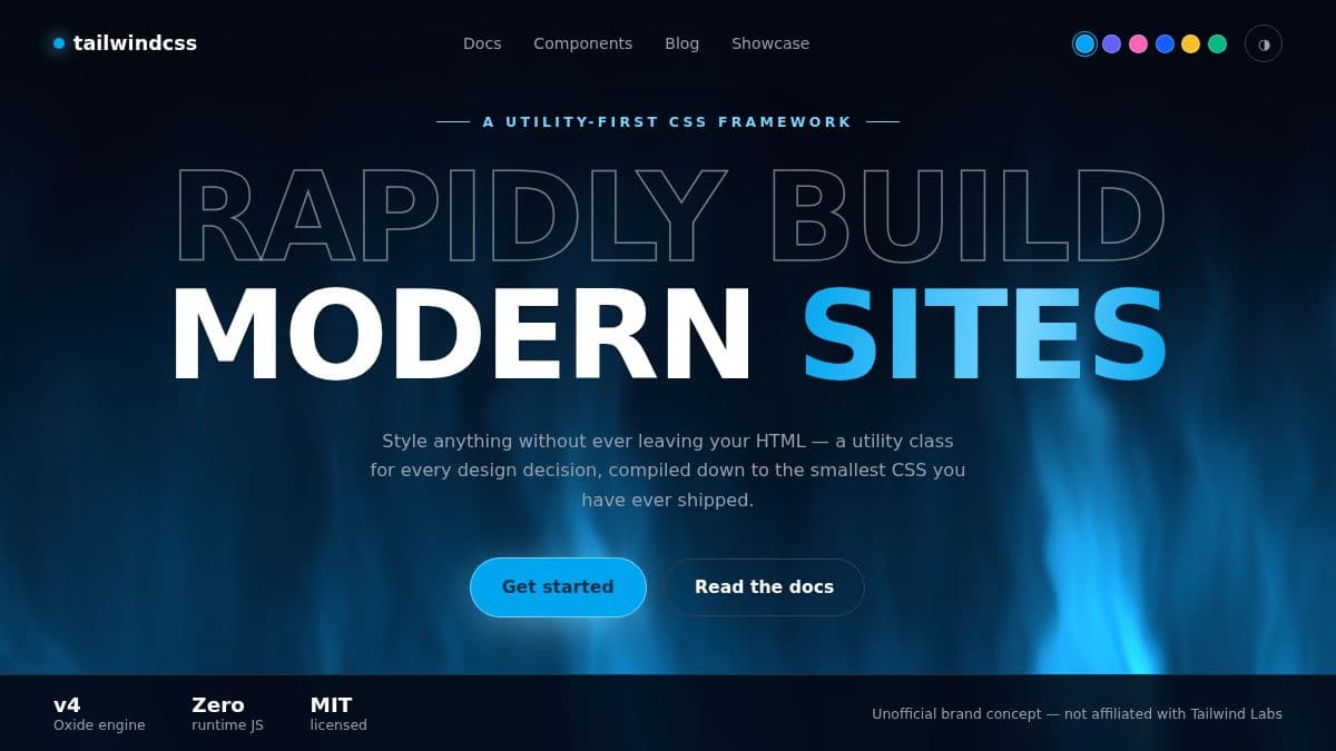
source: tailwindcss.com
A full-viewport aurora shader in the brand's own sky blue, with monumental type rising through the light. Four of the six palettes are colours pulled straight from the site; amber and emerald are curated complements so the set isn't six shades of one hue.
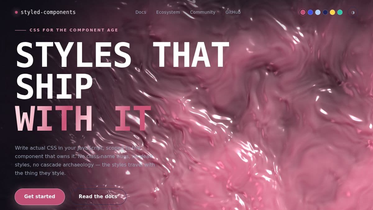
source: styled-components.com
A molten surface that ripples under the cursor, cast in the brand's signature raspberry. The site's periwinkle failed AA against both white and dark text, so it was deepened until it passed — the family survives, the contrast problem doesn't.
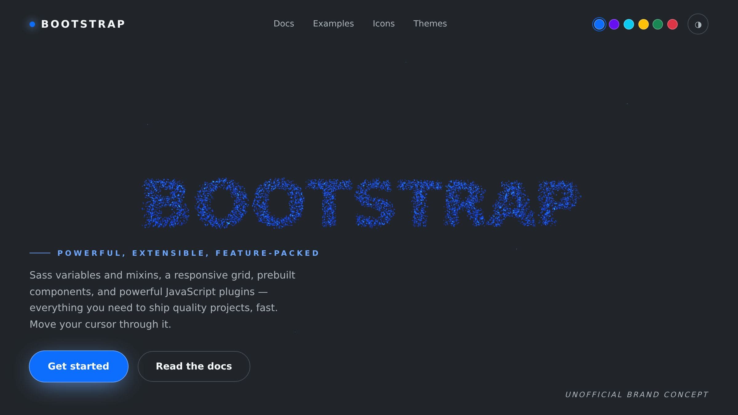
source: getbootstrap.com
Nine thousand particles assemble into the brand word, scatter from the cursor, and reform. The six palettes here are the brand's own semantic colours, so switching tone still reads unmistakably as the same product.
> STRAIGHT ANSWERS
These are unofficial concepts. Bootstrap, Tailwind Labs, and styled-components did not commission or endorse them. They are public sites with strong, recognisable brands — which makes them an honest test of whether the colour matching works on somebody else's design, rather than a palette invented to flatter itself.
The extraction is automated; the taste is not. Pulling colours from a stylesheet is deterministic and fast. Deciding which one is the real brand hue, what complements it, and where a colour has to bend to stay readable is a human decision every time. Where a site's stylesheet gave a weak signal, the live site was read directly and the profile says so instead of shipping a confident guess.
Every claim here was measured. “AA 9/9” is a contrast check over every text and button pair each piece commits to. “0px overflow” means each page was loaded in a real browser at 1440px and 390px wide and measured. Three real defects turned up during those checks — unreadable footer text over the animation, a cut-off footer, and a phone-width overflow — and all three were fixed before these screenshots were taken.
The brand extraction, the contrast guard, and the direction round that produced these are all commands in the toolkit — the same one that generated the free hero pack.